Stock chart patterns are tools that traders and investors use to understand how the market is performing. They provide the ability to study historical prices and movements to ascertain how an asset may move or react in the future.
For example, many traders use support and resistance levels to help them enter and exit positions. Those levels are judged based on historical chart performance. If a level has held strongly previously, a trader may see it as an area to enter in the opposite direction. Traders use many types of stock chart patterns.
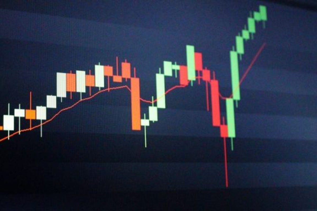
What Are Stock Chart Patterns?
Stock chart patterns provide distinctive signals on where the price of an asset may go in the future based on previous movements. They signal a transition to rising or falling market trends and can be identified by a series of historical data sets like the candlestick chart or line chart.
Support and resistance levels can help traders decide on entry and exit points within a trade. These levels are evaluated based on previous performance and whether a level remains strong.
However, other stock chart patterns include pennants, flags or head-and-shoulder patterns. These patterns are used to determine or assess the future price of an asset. These levels can signal patterns such as a trend reversal or a continuation pattern.
Nobody can predict the future, but stock chart patterns can help traders gain an edge. A price pattern can be recognized by common price points during a specific period or over the long term.
Reading stock charts is a popular method of technical analysis to predict future prices. Some patterns alert traders to buy while other practices indicate a selling opportunity.
The Most Effective Stock Chart Patterns
Effectively reading stock chart patterns can give you an edge as a trader. Here are a few you might want to learn more about.
Head and shoulders: A head-and-shoulders pattern can help predict a bullish or bearish reversal. That pattern may form when a stock’s price rises to a peak, declines and rises above the previous height to form the head. The price jumps again but to a level below the head and similar to its first peak.
These moves can signal a reversal in an uptrend that may be coming to an end, and traders may look at a sell position.
Continuation: The continuation pattern is a pause in a specific trend. For example, after a significant uptrend, bullish investors and traders may take a break after a substantial run higher, or the asset may be valued too highly. A triangle pattern is another example of this type of price action, where the stock price moves in a sideways direction within a price channel, getting narrower until it breaks out either up or down.
Pennant: A pennant pattern is formed when two trendlines meet. A key feature of this pattern is that one trendline will be heading higher while the second trendline will be heading lower. Eventually, the two meet, and the price is likely to break out in a particular direction. It is considered a continuation pattern because of its occurrence within a larger trend to the upside or downside.
A break below the trendline will signal a bearish pattern at the end of the pennant whereas a break above the trendline will signal that a bullish pattern may be forming. You may see weaker volume towards the end of the pennant, followed by a significant increase in volume. Understanding trading patterns is crucial when analyzing a price chart.
Flag Pattern: Flags are constructed by two trendlines that are parallel to each other. These trendlines will slope in either direction, but an upward flag may be a pause in a down-trending market, and a downward flag may show a break in an up-trending market.
A price trend may slow, which reduces volume. However, once the price is able to break out of the formation, the market trend is likely to continue.
Ascending triangle pattern: The ascending triangle marks a particular trend and indicates increasing demand. The top line is the resistance level, and the ascending level can be used as an entry level during a bullish run. An ascending triangle usually occurs during a bullish run and is much more unusual in a bear market.
The opposite of this trading pattern is a descending triangle. It occurs the same way but for a bearish run. It suggests a pullback is likely.
Gaps: Gaps are formed by a space between two trading periods. For example, the closing price on the day is $10 but the market opened at $12 the next day because of considerable demand on the buy side.
Gaps can occur in different ways. One occurs at the start of a significant trend. Another may happen in the middle of a trend, or a gap can occur at the end of a trend as demand begins to waver.
Double top and bottom: A double top is a reversal pattern where the price makes an unsuccessful attempt to break its previous high, which results in a pullback. A double bottom indicates an unsuccessful attempt by the price to break its prior lows.
A resistance or support level forms where the price struggles to break through, often leading to a reversal in the trend. You may see a triple top or bottom if the price continues to test the level.
Symmetrical triangles: A symmetrical triangle pattern can occur when the price has been moving in a sideways manner for some time within a trading range. If there has been no clear trend, then two trendlines look to converge. However, as the price changes less and volume begins to slow down, a breakout may occur by trending higher or lower.
Are Stock Chart Patterns Always Right?
Price and stock chart patterns occur frequently and can happen at any point after an uptrend or a downtrend. Periods of consolidation are normal. However, chart patterns are not always correct. Many factors influence a stock’s price, and a chart pattern could be a small part of the bigger picture.
Stock chart patterns provide an edge via an increased probability of an outcome occurring. For example, one trader witnessing a triple bottom reversal pattern might see things differently than another trader noticing a continuation pattern.
Other important data points such as volume, price and macroeconomic and geopolitical events can affect a stock price. But chart patterns can represent an area where supply or demand may increase or decrease.
Stock chart patterns such as flags or pennants are not always correct. Most successful traders use chart patterns in addition to other strategies. Chart patterns are evident in hindsight, but they may not be as easy to spot right before the break. Looking at the bigger picture can help you pick suitable setups.
Not every pattern will go in your favor, so gaining experience spotting chart patterns is important.
Compare Stock Charting Software
To test various trade chart patterns, traders might open a demo account with a broker to practice. Looking for the best broker can be difficult, especially when you need excellent charting software to come with it, but Benzinga provides information about some of the best.
Frequently Asked Questions
Q
Are stock chart patterns easy to read?
A
Stock chart patterns can be easily read once you gain experience in the market. It’s all about spotting the opportunity as it arises. Technical analysts look for these price patterns, and you can forecast potential future price behavior once it is presented. It may be difficult to discern a trading chart in the early stages, but as time goes on and you gain experience, you should be able to read the markets more skillfully.
Q
Do stock chart patterns always give the same results?
A
Stock chart patterns will not always provide the same results. The use of stock chart patterns assists in a trading plan and gives the trader an edge through the increased probability of a specific outcome occurring.